September 10, 2024
Building Design Systems with Lottielab: A Tide Business Case Study

Competition is fierce in today's digital banking world; a stellar user experience is often the secret sauce to customer loyalty. Design is central to shaping this experience, which is why Tide, a UK financial technology company, established a product area called Experience Foundation. This team of product managers and designers have one goal: to evolve the platform's end-to-end user experiences to drive greater value and differentiation.
Tide, headquartered in London, is a fintech company that provides mobile-first banking services to small and medium-sized enterprises. It enables businesses to set up a current account and get instant access to various financial services (including automated bookkeeping and integrated invoicing). Launched in 2017, Tide is now the leading business financial platform in the UK, with 575,000 SME members (10% market share) and more than 250,000 SMEs in India.
We had a brief chat with Abhijeet Ranjan, a product designer on Tide's Experience Foundation (XF) team. In this article, Abhijeet shares how Lottielab transformed Tide's approach to design, making animation accessible to the entire team and streamlining their workflow. From simplifying complex processes to enabling creative freedom, discover how Lottielab became an essential tool in Tide's design toolkit.
Discovering Lottielab
Abhijeet, an experienced motion designer proficient in After Effects, stumbled upon Lottielab on social media. The team at Tide was searching for a tool that could democratise animation creation across their design teams. "I am very good with After Effects and many other tools, but we needed a tool that was easy for all our designers to use, not just the motion experts," Abhijeet explains. "Even for folks on the product or onboarding teams, we wanted a tool that was accessible to them to be able to add some simple animations to their designs."
Why Lottielab?

For Abhijeet, Lottielab's ability to work harmoniously with existing tools like Figma and After Effects was a stand-out feature. "The big issue we had with the tools we tried before was support with our existing tools like Figma and After Effects. It just wasn't there. For me, the game-changer was that I could switch from After Effects to Lottielab seamlessly. Being able to copy and paste straight from After Effects saved me so much time," he enthuses. "I used to spend ages on asset management from one tool to the other, but now I can focus on actually making animations."
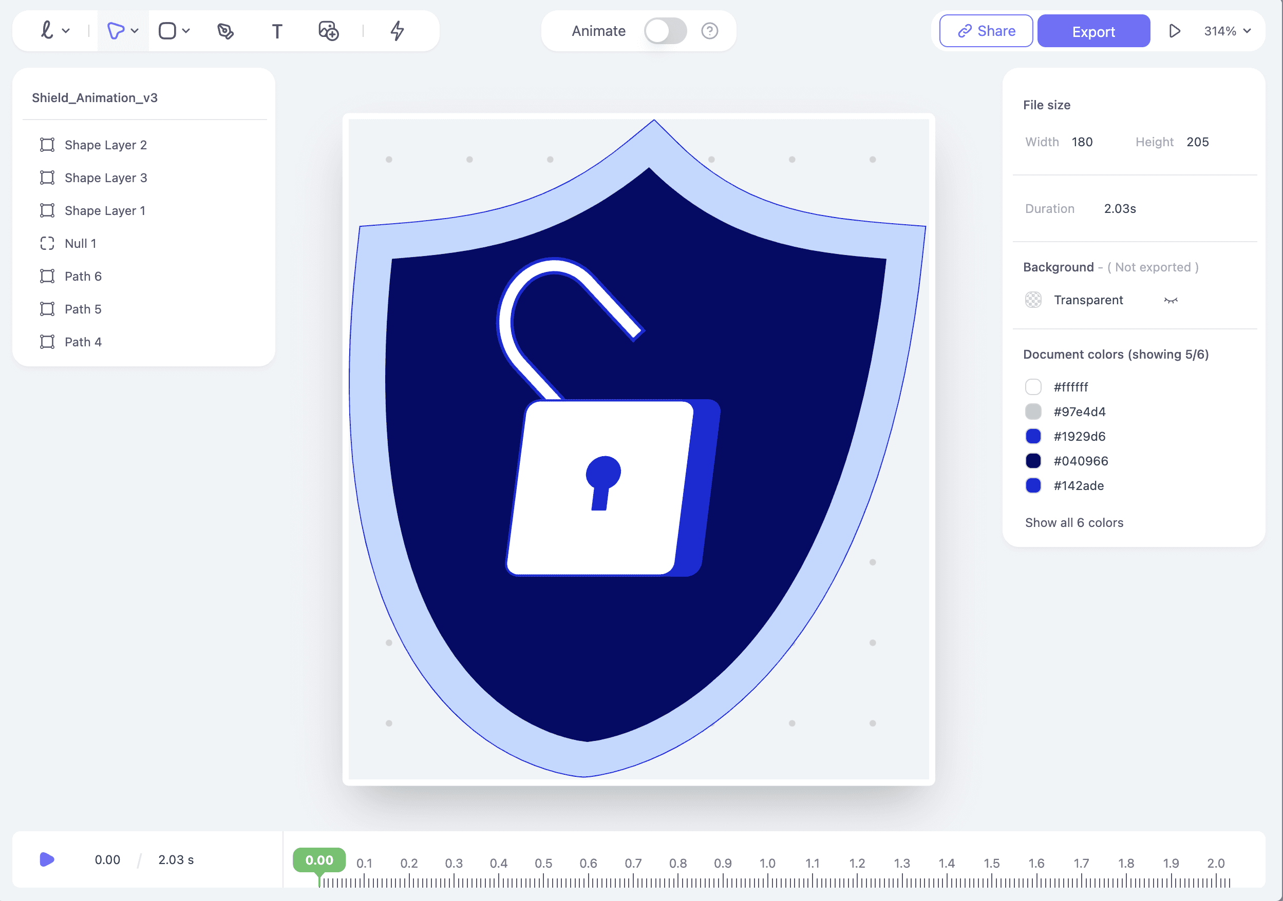
Another game-changing feature was Lottielab's efficient handoff process. "Lottielab's handoff makes building our motion design system 10x easier," Abhijeet notes. "Before, we had to manually recreate timelines from After Effects, specifying every little detail like opacity changes down to the millisecond. It was tedious. I also like the built-in seconds-to-milliseconds conversion, which is handy. Most motion design happens in milliseconds, you know? A one-second transition is an eternity in this world. If you could add a way to convert between seconds and milliseconds right in the timeline automatically, that would be amazing."

Lottielab's accessibility for designers of all skill levels was also a significant advantage. Abhijeet shares, "Lottielab's UI is really simple and intuitive. If I showed After Effects to my team, they'd be totally lost. But with Lottielab, I just shared a YouTube tutorial, and the next day, they were comfortable using it, even without any prior motion design experience."

Beyond these technical features, Lottielab's community turned out to be an invaluable resource. "We imported this illustration and wanted to add a simple shine effect – you know, the kind you see everywhere. I was surprised to find a pre-made shine effect in the community files. I just copied and pasted it, and it worked perfectly! That was a real 'aha' moment for me. Usually, I'd have to create that effect manually in the illustration software and then animate it with masks and all that. But with LottieLab, I could just grab it from the community and drop it right in. This made me realise that if someone on my team, or even someone from the community, created an effect I liked, I could just copy and paste it into my project. No need to reinvent the wheel every time! That was a huge time-saver, and it opened up a whole new world of possibilities for collaboration and efficiency."
So, would Abhijeet recommend Lottielab to other designers?
"Absolutely. I've become a big advocate for Lottielab since I started using it. It's just so easy to use. Four years ago, when I started in motion design After Effects was the go-to tool, even for simple product animations. However, not everyone needs to create Netflix-level visuals. Most product companies, like us, need smaller, more manageable animations. Learning After Effects and investing in it just isn't worth it for them. That's why I'd recommend LottieLab."
As Tide prepares for a major project to revamp their entire illustration system, Lottielab has become their tool of choice. "We plan to animate most of it, and Lottielab will be our main tool," Abhijeet explains. "After Effects is too complex, and I'm the only one on the team who knows how to use it. With hundreds of animations to create, we need something accessible to everyone."
Of course, no love story is without its little quibbles. Abhijeet mentions he'd love to see Flutter integration in the future.
Lottielab didn't just change how Tide creates animations - it transformed their entire approach to design, empowering every team member to bring a little magic to their work. As Tide moves forward with their ambitious redesign project, Lottielab stands as their trusted partner in bringing their vision to life, proving that sometimes, the right tool can make all the difference in elevating a product's user experience. And isn't that what great tools are all about?